Rebrand and creative direction for Helping Hand Environmental, creating a dedicated sub-brand focused on environmental and gardening products while maintaining a clear connection to The Helping Hand Company.
The Challenge:
Helping Hand Environmental needed a distinct identity that could separate its environmental and gardening products from the wider Helping Hand range, while still retaining the trust and recognition associated with the parent brand. The challenge was to create a cohesive and credible visual identity that could work consistently across retail, packaging, and trade show environments.
Helping Hand Environmental needed a distinct identity that could separate its environmental and gardening products from the wider Helping Hand range, while still retaining the trust and recognition associated with the parent brand. The challenge was to create a cohesive and credible visual identity that could work consistently across retail, packaging, and trade show environments.

The Idea:
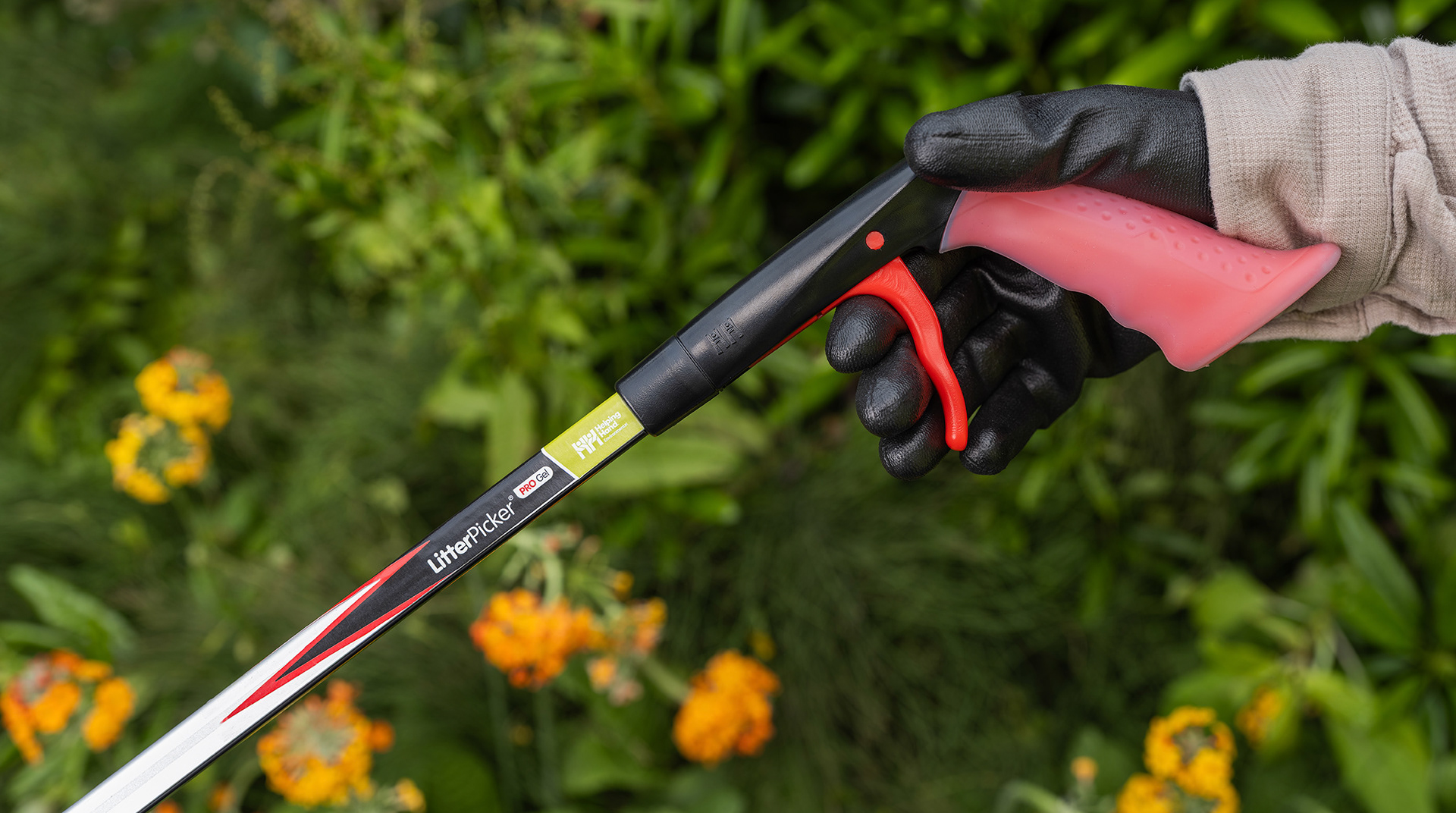
The rebrand built upon the existing visual language of The Helping Hand Company, using the established green from the parent brand to create familiarity while introducing a more focused identity tailored to the environmental sector. A distinctive use of red across the product labels was also introduced to improve shelf visibility and make products instantly recognisable in real-world retail environments.
The rebrand built upon the existing visual language of The Helping Hand Company, using the established green from the parent brand to create familiarity while introducing a more focused identity tailored to the environmental sector. A distinctive use of red across the product labels was also introduced to improve shelf visibility and make products instantly recognisable in real-world retail environments.

The Solution:
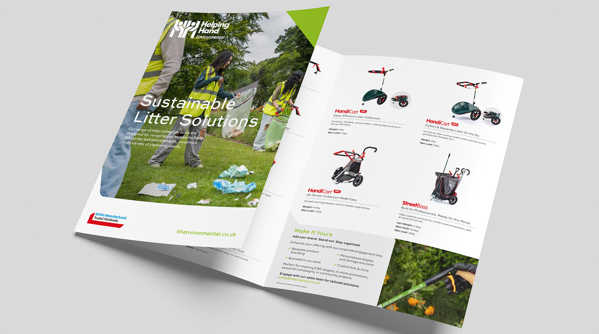
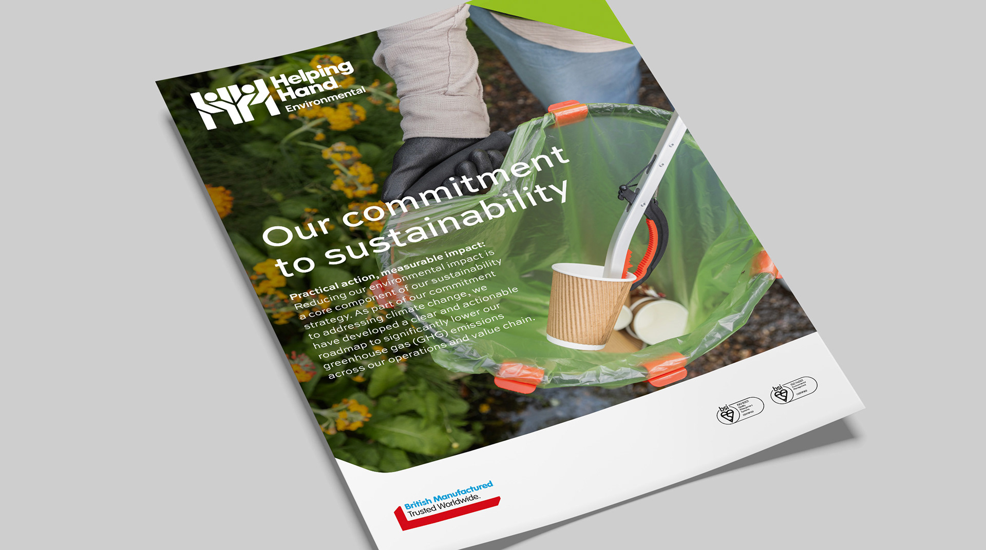
A refreshed brand identity and creative direction were developed across a range of customer touchpoints including brochures, flyers, product labels, and trade show materials. The rollout created a consistent visual presence across both physical and digital applications, helping position Helping Hand Environmental as a dedicated and recognisable sub-brand within the market.
A refreshed brand identity and creative direction were developed across a range of customer touchpoints including brochures, flyers, product labels, and trade show materials. The rollout created a consistent visual presence across both physical and digital applications, helping position Helping Hand Environmental as a dedicated and recognisable sub-brand within the market.



Impact:
The rebrand launched at GLEE through a series of trade show materials and supporting collateral, helping introduce the updated identity to retailers and industry audiences.
The rebrand launched at GLEE through a series of trade show materials and supporting collateral, helping introduce the updated identity to retailers and industry audiences.

Interested in collaborating or discussing a project? Let’s talk.